|


|

Mortality per million population allows comparison between countries. Major differences are caused by differences in anti-epidemic strategy, which may be affected by the preparedness of countries to the epidemic.
We would like to make two important notes.
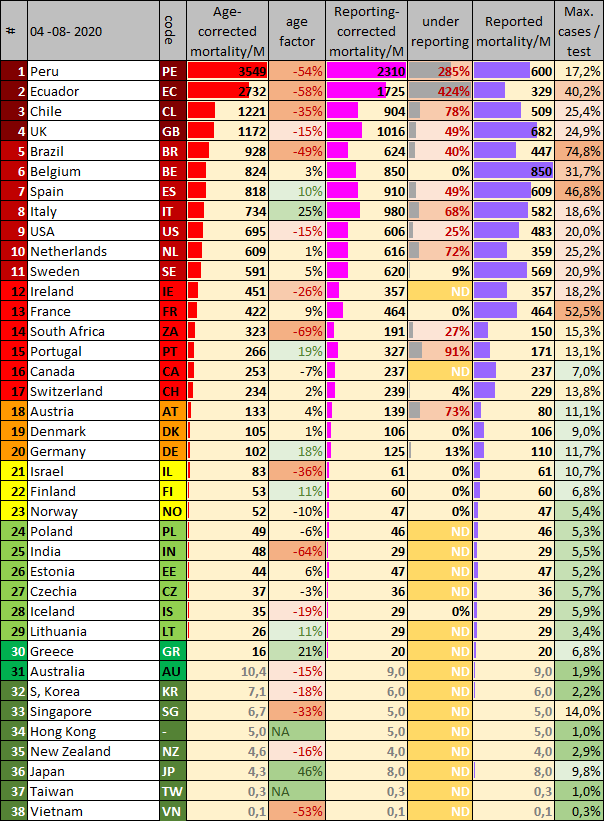
Using the double-corrected data, a ranking is made from dark red to dark green. The current ranking is (Table 1):
It is striking that the best-performing countries are located near Southeast Asia, where the SARS-1 epidemic started in China 18 years ago. Many countries learned from this epidemic and were prepared for a new epidemic[3] Every virologist could have predicted that a new epidemic would come, as I - John Jacobs - did in 2003.[4]
Controlling a virus epidemic requires a different strategy than a bacterial epidemic. The default anti-virus strategy is testing, proactively detecting and isolation of infected cases.[5] To do this correctly is double efficient: lower disease mortality rates, and less social and economic damage, as only infected cases should be isolated. It is also widely practiced in case of veterinary epidemics.[6]
The policies of European and North American countries had weak to poor antivirus results.
We should learn from this epidemic.
[1] RIVM is national institute for health and environment. https://hartblik.weebly.com/addendum-correctie.html
[2] https://hartblik.weebly.com/beter-c-verschillende-strategieeumln.html
[3] https://hartblik.weebly.com/voorkom-epidemie.html
[4] https://hartblik.weebly.com/ontsnappende-virussen.html
[5] https://hartblik.weebly.com/fighting-covid19.html
[6] https://hartblik.weebly.com/betere-bestrijding-van-de-epidemie.html
[7] https://hartblik.weebly.com/foute-afweer.html
[8] https://hartblik.weebly.com/beter-a-impact-covid-19.html
[9] https://hartblik.weebly.com/cijfers-en-data.html
[10] https://hartblik.weebly.com/verloren-door-te-weinig-kennis.html
We would like to make two important notes.
- Countries differ in the way they count their mortality rates. The Dutch regional GGD stated early in the epidemic that the national RIVM did not count all cases, i.e. the Netherlands have relevant under reporting of cases.[1] People dying in nursing homes are rarely counted, since these patients will not be tested, even when suffering from COVID-19 symptoms. The Dutch statistics do not could untested people as COVID-19 victims. The data can be corrected for excess mortality. Because the data on excess mortality is delayed for about three weeks, a fixed correction factor is applied.[2]
- Populations differ in age distribution, and old people have higher mortality rates due to COVID-19.
Using the double-corrected data, a ranking is made from dark red to dark green. The current ranking is (Table 1):
- Dark red:> 1000 deaths per million population (> 1000 deaths / M). Ecuador, Peru, United Kingdom, Chile.
- Medium red: 500-1000 deaths / M. Brazil, Belgium, Italy, Spain, Netherlands, Sweden, USA.
- Light red: 200-500 deaths / M. France, Ireland, Switzerland, Portugal, Canada
- Orange: 100-200 deaths / M. Austria, Denmark, Germany, South Africa,
- Yellow. 50-100 deaths / M. Finland, Norway, Israel,
- Light green: 20-50 deaths / M. Estonia, Czech Republic, Poland, Lithuania, Iceland.
- Medium green: 10-20 deaths / M. Greece
- Dark green: <10 deaths / M. South Korea, Australia, New Zealand, Japan, Taiwan, HongKong, Singapore..
It is striking that the best-performing countries are located near Southeast Asia, where the SARS-1 epidemic started in China 18 years ago. Many countries learned from this epidemic and were prepared for a new epidemic[3] Every virologist could have predicted that a new epidemic would come, as I - John Jacobs - did in 2003.[4]
Controlling a virus epidemic requires a different strategy than a bacterial epidemic. The default anti-virus strategy is testing, proactively detecting and isolation of infected cases.[5] To do this correctly is double efficient: lower disease mortality rates, and less social and economic damage, as only infected cases should be isolated. It is also widely practiced in case of veterinary epidemics.[6]
The policies of European and North American countries had weak to poor antivirus results.
- Mortality is higher, sometimes up to 100 times higher than in Asian and Australian countries.
- The impact on social well-being and the economy is much greater.
- The differences within Europe are also huge when Greece and Lithuania are compared to the United Kingdom and Belgium.
We should learn from this epidemic.
- It is very doubtful if we will develop a good and safe vaccine soon, since, vaccination is a hard strategy when antivirus immune responses contribute to mortality. It could be that antibody-mediated immune responses are the cause of mortality.[7] In most European countries only about 5% of the people were infected, so this epidemic could continue to spread for a considerable time with the potential to cause high mortality rates.[8] The need to learn and act from the learnt lessons from this epidemic is paramount.
- New virus epidemics will come. Just like the prediction of this epidemic decades ago, we know that a new RNA virus epidemic will arise after AIDS, SARS-1, MERS, Ebola and SARS-2.
- Our epidemic policy has a major impact on human behaviour and thus on the virus epidemic.[9] If we are prepared,[10] the impact could be similar to the South East Asian and Australian countries that prepared themselves after SARS-1.
[1] RIVM is national institute for health and environment. https://hartblik.weebly.com/addendum-correctie.html
[2] https://hartblik.weebly.com/beter-c-verschillende-strategieeumln.html
[3] https://hartblik.weebly.com/voorkom-epidemie.html
[4] https://hartblik.weebly.com/ontsnappende-virussen.html
[5] https://hartblik.weebly.com/fighting-covid19.html
[6] https://hartblik.weebly.com/betere-bestrijding-van-de-epidemie.html
[7] https://hartblik.weebly.com/foute-afweer.html
[8] https://hartblik.weebly.com/beter-a-impact-covid-19.html
[9] https://hartblik.weebly.com/cijfers-en-data.html
[10] https://hartblik.weebly.com/verloren-door-te-weinig-kennis.html
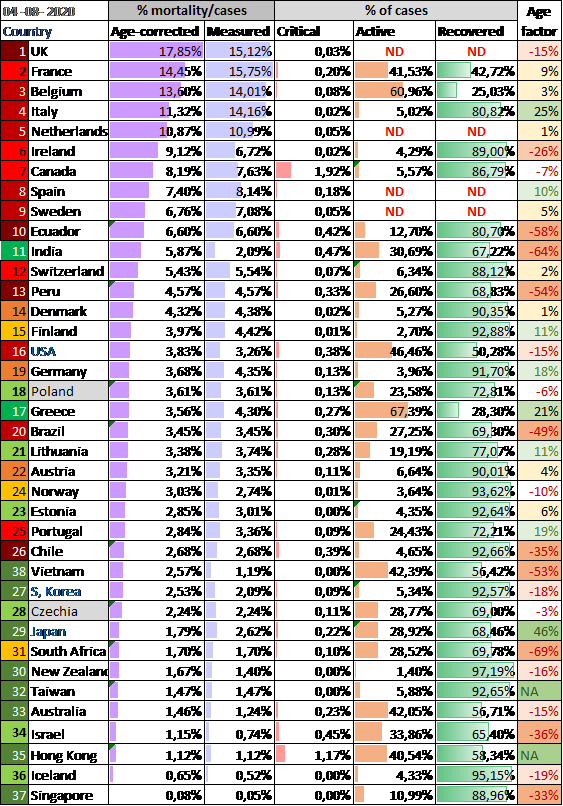
Table 1. Overview of mortality per million people (mortality/M), the raw data, corrected for underreporting [1] and age. Data to determine under reporting is derived from various sources.[2] - Economist 1 & 2, FT, WP.
---
[1] https://hartblik.weebly.com/beter-c-verschillende-strategieeumln.html
[2] https://www.economist.com/graphic-detail/2020/04/16/tracking-covid-19-excess-deaths-across-countries , https://www.economist.com/europe/2020/05/09/many-covid-deaths-in-care-homes-are-unrecorded , https://www.ft.com/content/6bd88b7d-3386-4543-b2e9-0d5c6fac846c , https://www.washingtonpost.com/investigations/2020/04/27/covid-19-death-toll-undercounted/?arc404=true
https://www.ft.com/content/a26fbf7e-48f8-11ea-aeb3-955839e06441 dd 10 & 17 juni & 13 juli
Raw numbers
The Corona Dashboard 1.0 was launched in Dutch at 18th of April 2020 on our websites 1 & 2.[1] It focused at the EW16, 16 ‘modern’ European countries with a population of at least 5 million people. These countries share political, democratic, social economic and technological development, making them excellent for internal comparison. The list consists of Austria, Belgium, Denmark, Germany, Finland, France, Greece, Ireland, Italy, the Netherlands, Norway, Portugal, Spain, Sweden, Switzerland and the United Kingdom. Japan, Republic of Korea (South) and the USA are added to complete the list - therefore EW16+3.
---
[1] https://hartblik.weebly.com/dashboard-i.html https://gijsvanloef.nl/2020/04/18/corona-dashboard-w28/
---
[1] https://hartblik.weebly.com/dashboard-i.html https://gijsvanloef.nl/2020/04/18/corona-dashboard-w28/
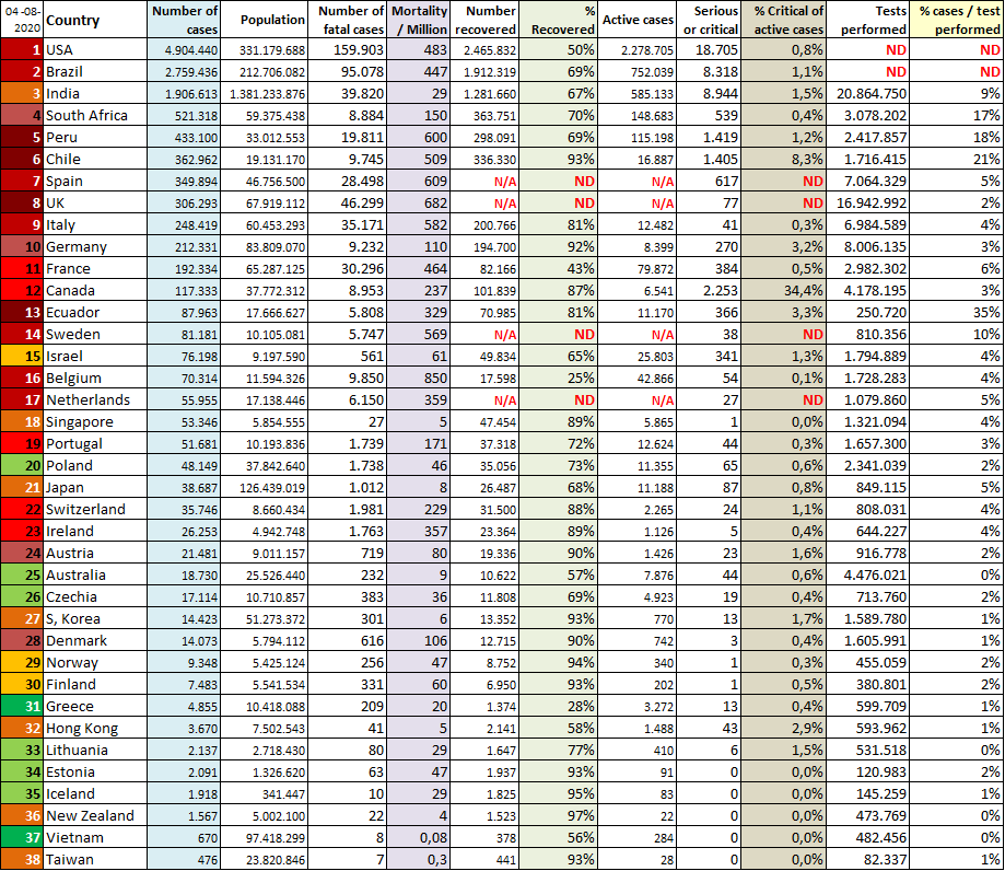
Not all nations are capable of providing all essential data to fight COVID-19. Some countries do not know how many people have recovered from the disease.
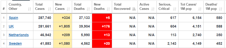
Table 2a. Countries lacking recovery data. Source worldometer
Reported mortality rates
The 16 European countries have huge differences in the mortality rates they report. Remarkable, the epidemic in Spain is the first one to have higher numbers of mortality, even before Italy. In Belgium the epidemic raised to the highest (uncorrected level), before being stopped (at about 6%) by the national policy.
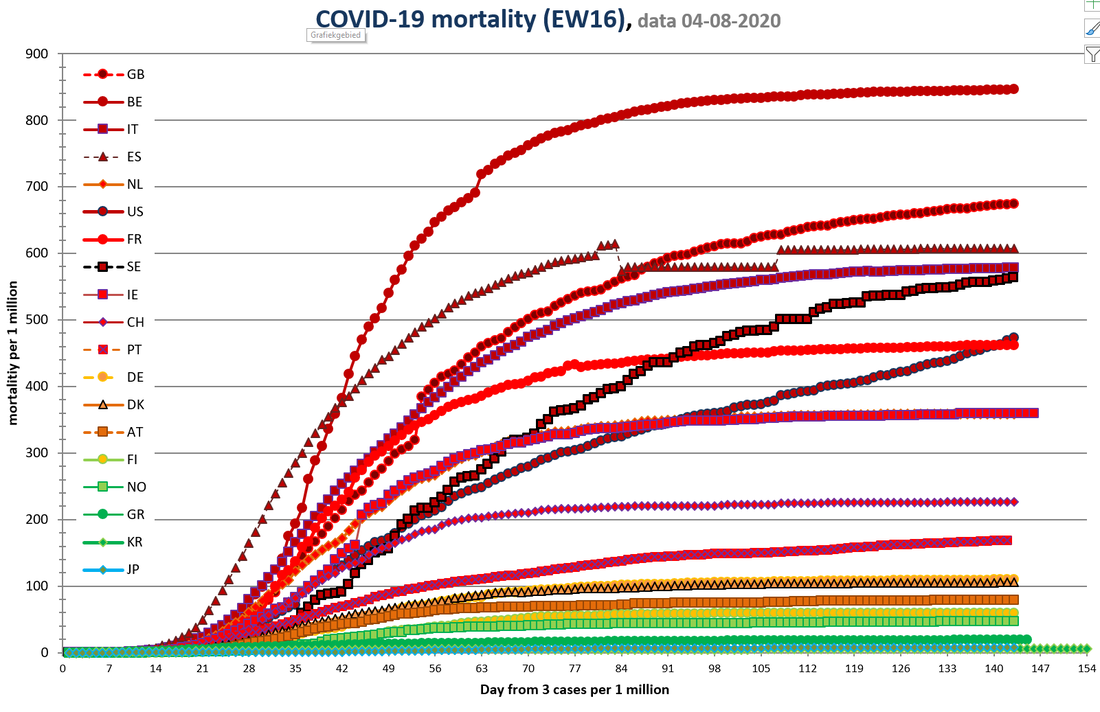
Figure 1. Mortality rates for EW16+3.
Country codes are explained in Table 1.Spain corrected mortality data at May, 25th
Country codes are explained in Table 1.Spain corrected mortality data at May, 25th
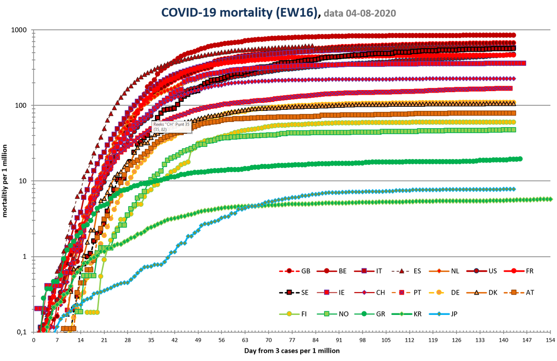
Figure 1A. Mortality rates for EW16+3. Same as Figure 1, but with logarithmic scale.
Case mortality rates
Case mortality rates show the differences of cases per country. Age corrections is shown to compensate for difference is population distribution.
Table 3. Case-mortality rates.
Number of critically ill and recovered persons. The lack of data on how many people have recovered is, shows the limitations of the care registration systems in the Netherlands and the United Kingdom. These countries have disease registration systems that cannot be used to monitor how many people are suffering from a disease.
Number of critically ill and recovered persons. The lack of data on how many people have recovered is, shows the limitations of the care registration systems in the Netherlands and the United Kingdom. These countries have disease registration systems that cannot be used to monitor how many people are suffering from a disease.
Link between testing and mortality
Flu-like symptoms are no evidence for COVID-19, and not everyone infected by SARS-2 will develop symptoms. Policy making on symptoms fails because it discriminates poorly and would have people repeatedly in quarantine due to colds or other respiratory complaints (e.g. air pollution by wood smoke). People succumbing to COVID-19 usually don't go to many places anymore. Infected people are contagious before they get sick, and not everyone will develop symptoms. The high number of sick people in the Netherlands is partly related to many infected people continuing to spread the disease unmonitored, some even working in care facilities.
Proactive testing starts with testing everyone that has symptoms. If someone test positively, all the contacts will be tested. All contacts who are negative will be retested after 1 and 2 weeks. All infected people will remain in isolation -eg in their own house or in special hotels. In Wuhan, the government delivered groceries at their homes, to avoid the need of leaving their homes, to avoid the need of going outside.
An active testing policy will test many people who are not infected, because the infection rate in the population is usually (far) below 2%. Passive testing leads to a much higher number of infections per test. The danger of passive testing is that many infected people are hidden in the population. It is estimated worldwide that half of the infections are caused by people without symptoms. These infections mainly occur in countries that do not test enough. People without symptoms and without a test result have no urgent reason to isolate themselves from social activities or go for quarantine. Figure 2 shows the statistical relationship between the maximum percentage of positive tests in a country and the mortality rate in the population from COVID-19. Corrected data yielded similar results.
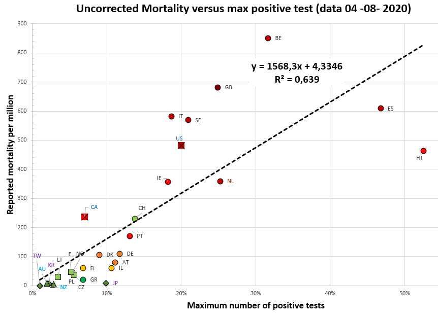
Figure 2. Relation between crude mortality rate and lack of proactive testing policy.
The shape of countries corresponds to their continent (circle Europe (EW-16), square other Europe, cross North America, triangle: Australia, diamond: Southeast Asia). Clear correlation. For reference R^2> 0.5 is considered a very clear connection in this domain. Country codes are explained in Table 1.
[1] https://hartblik.weebly.com/dashboard-i.html
Current status
The current status shows how the epidemic develops in various countries. Many European countries have experienced a nonspecific lockdown to defeat the virus' first wave that has paused the epidemic. This required more time in countries that have had a high peak, such as Belgium (Figure 3). Some countries still have significant numbers of new deaths (2-5 / M): Sweden, United Kingdom and USA, approximately a quarter of their peak values.
Given the impact of the lockdown, it is obvious that many countries will let the loosen their restrictions. In Europe this is happening now (end of May). This could reactivate the epidemic. The start of the epidemic is less noticeable in a cumulative graph than in a daily graph. Due to daily fluctuations, the data here is averaged over several days.
Given the impact of the lockdown, it is obvious that many countries will let the loosen their restrictions. In Europe this is happening now (end of May). This could reactivate the epidemic. The start of the epidemic is less noticeable in a cumulative graph than in a daily graph. Due to daily fluctuations, the data here is averaged over several days.
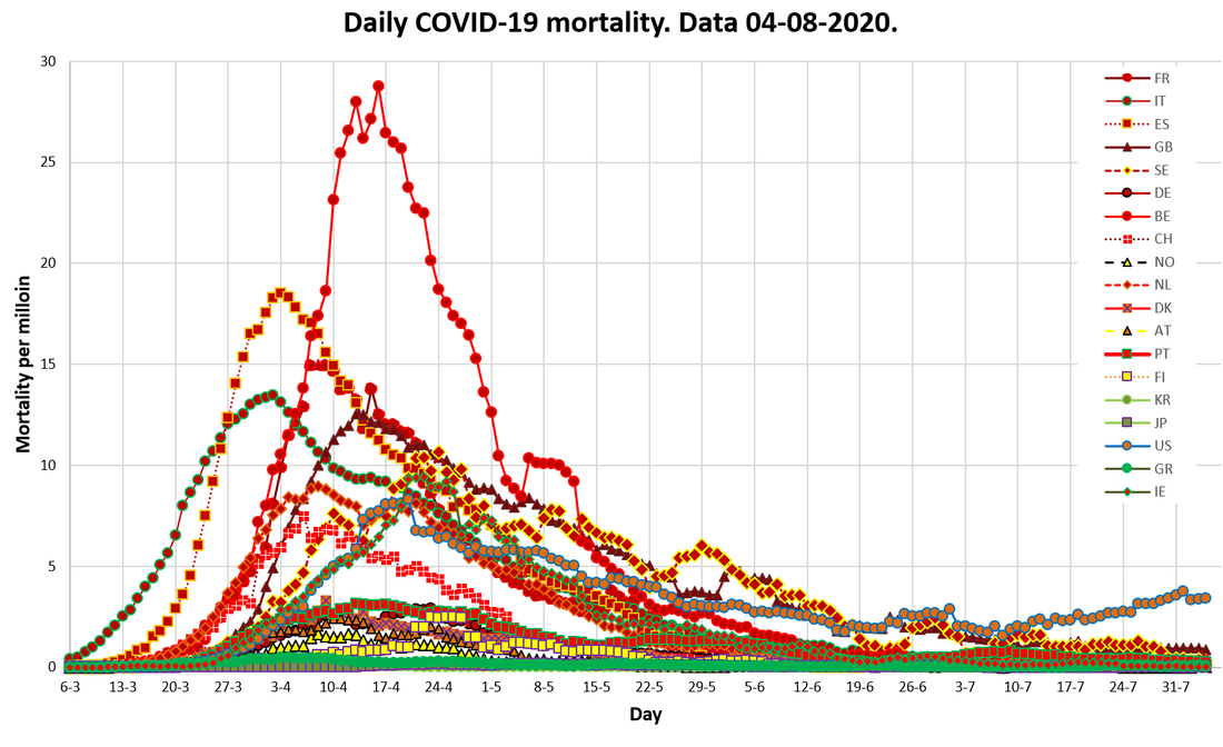
Figure 3. Daily mortality rates for 16 European countries + 3.
Moving average over 3 to 5 (and 7 if missing today) filtered for negative values and extreme high values (often data corrections). Country codes are explained in Table 1.
Moving average over 3 to 5 (and 7 if missing today) filtered for negative values and extreme high values (often data corrections). Country codes are explained in Table 1.
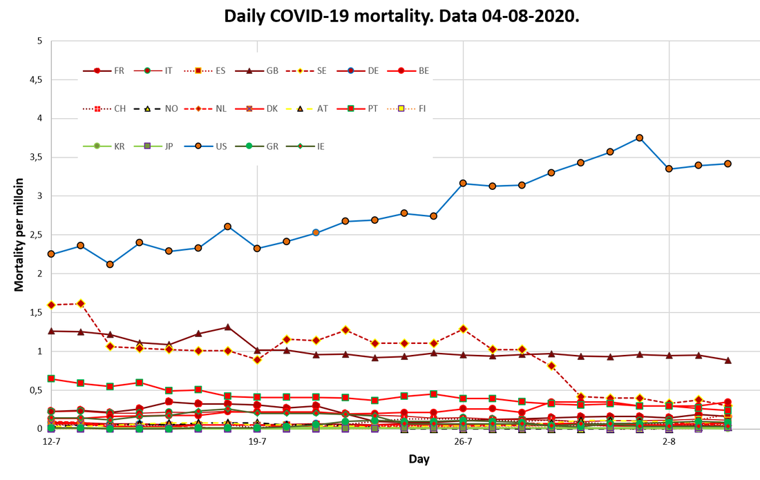
Figure 3A. Zooms in on the most recent dates of Figure 3.
Regional numbers
Table 4 shows mortality rates per region. These are highest in the unbound European areas (e..g. United Kingdom, Switzerland), followed by the USA, the traditional EU, Canada, Latin America, Eastern-Europe and the new East-European EU countries.
Table 4. Regional mortality numbers
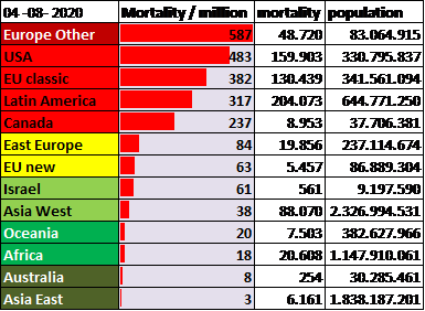
Figure 4 shows the differences in epidemiological changes per region. The line of 10 fatal cases per million is an arbitrary boundary between epidemics that are or are not apparently controlled. Figure 4A zooms in at the data below this line. Other Europe, especially the UK, still has high mortality rates in May, and might cross the line at July 7th. A similar pattern can be found for the USA, with somewhat lower heights, but also a still increasing mortality rate. Canada is similar to the USA, but at a slightly lower level. Latin America exceed the 10 fatal cases per million only since May 13th.
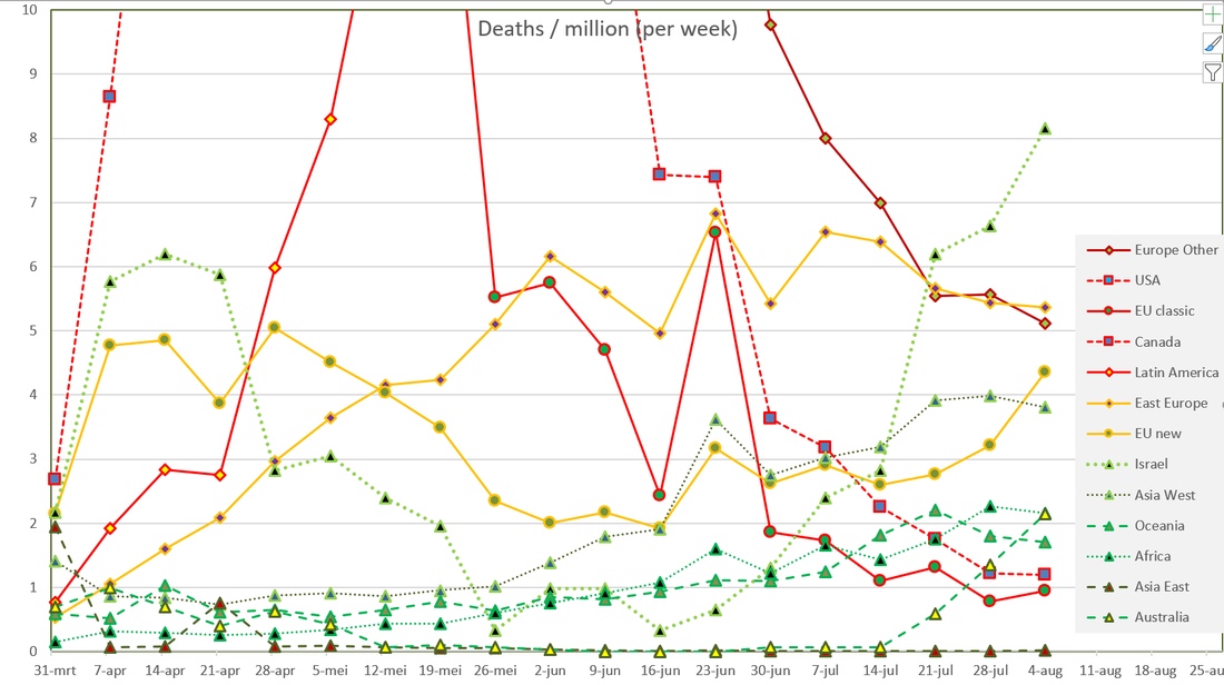
Zooming at the low numbers in Figure 4A, shows increasing mortality rates In Eastern Europe, that do not cause direct reasons to worry. Africa appears to have low mortality rates, but since June it is slightly increasing above 1 per million. Remarkable are the low mortality rates in China’s neighboring countries, that immediate controlled the epidemic in Eastern Asia, Australia and Oceania. These countries were well prepared after previous virus outbreaks starting in China.
Zooming at the low numbers in Figure 4A, shows increasing mortality rates In Eastern Europe, that do not cause direct reasons to worry. Africa appears to have low mortality rates, but since June it is slightly increasing above 1 per million. Remarkable are the low mortality rates in China’s neighboring countries, that immediate controlled the epidemic in Eastern Asia, Australia and Oceania. These countries were well prepared after previous virus outbreaks starting in China.
Figure 4. Development in regional mortality numbers
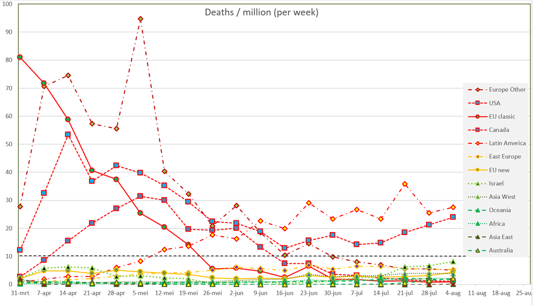
Figure 4A. Development in regional mortality numbers under 10 per million (detail from Figure 4)
August 2020
The epidemic is active in both America, but relatively quite elsewhere, like in Europe. Probably the epidemic will be more active in the 4th quarter of 2020. I will put this dashboard on hold. In the mean time I am preparing a public advice for the Dutch government.

John Jacobs & Gijs van Loef,
Corona Dashboard 1.0. 18th of April to 23rd of May.
2nd version 24 mei 2020. Daily data update/
Platform Betrouwbare Zorgcijfers
Corona Dashboard 1.0. 18th of April to 23rd of May.
2nd version 24 mei 2020. Daily data update/
Platform Betrouwbare Zorgcijfers